A Brief History of Tierceron
This "About" page has been empty for years because I didn't know what to do with it, but now I think it
might be fun to chronicle how the site has evolved over the years. It's always weird and awkward when an author
introduces themselves on the web but I'm going to do it anyway. I am Myles Skinner; I was known as Shamus in the
MUD and go by drskinner in various other places. I've been around the internet since before the web
was a thing—I remember at the time thinking that the whole WWW endeavour was a waste of time and would never
catch on. (Well, I was half right.) I've also been involved Covenant MUD since the very beginning and I've seen
all the changes. Let's talk a little history, shall we?
1998–2000

Long before we registered tierceron.com, Covenant MUD was hosted at quandary.mudservices.com, on a machine called "soap". The MUD itself was called "TMP", which stood for "TMP MUD Project"—TMP being standard computer jargon for "temporary" and recursive TLAs being an industry tradition.
The site launched on 05 May, 1998. By then, we'd settled on "Covenant" as the name of the MUD, and Wrathmolten created the pages and
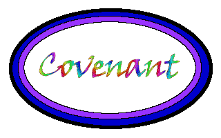
added the initial content. He also drew the logo—a magnificent early-web specimen featuring rainbow "web-safe" colours and thick,
nested ellipses. Behind the scenes, the site was built with HTML tags in ALL CAPS, employing deprecated tags like <FONT>
and <CENTER>. The very first bit of page copy optimistically declared, "This is the Covenant Information Page. You may
soon find valuable player information located on these pages."
In 1998, most players would connect to MUDs via telnet from their shell accounts, and it was still reasonable to expect that a significant percentage of our visitors would be browsing our site with Lynx, a text-based browser. As such, there were few images on the site and all the pages rendered cleanly in a standard 80x24 character terminal window. In true 1990s form, the main page contained only 87 words and yet managed to include the phrase "under construction" twice.
2000–2001

We registered tierceron.com on 18 July, 2000. We'd been hoping for covenant.com but that domain belonged to a beverage company (as of 2019, it belonged to a technical support company), so we ended up naming our domain after Tierceron, the main city and centerpiece of our MUD. To improve the focus on the city, Gailyana and I sat down and wrote The Tourist's Guide to Tierceron which is mostly useless for players but does supply a nice bit of background colour for our world.
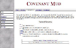
For this iteration of the site, we built the layout upon HTML tables. Layout tables are no longer considered a good practice, but at the time, you either made tables or you used frames, and frames are objectively terrible. We weren't sold on this new thing called "CSS", which was only two years old at the time. The monolithic grey background hearkens back to a time when literally every single page element competed to be the focal point of a website. While tame for the era, the textured background does overwhelm the content, and as a result, the site design feels cramped. A typical web browser would be looking at our site at a horizontal resolution of 800 pixels (pictured), although a number of users still visited us with resolutions as small as 640 pixels across, a viewport size that further reinforced the cramped feeling.
2002–2018

In 2002, Wrathmolten recruited me to write a Java application to support his new online store, RPGme. In the process, I learned how to use CSS, and decided to apply that knowledge to the Covenant MUD website while refreshing the look. I removed the layout tables and built a more modern template. I confined the grey background to the left navigation sidebar, giving the site a little more room to breathe. This look is clean, but also a little bland. But, then, I survived the web of the nineties. I think we all needed a little blandness at that time.
The first versions of this page did not include the tabbed navigation elements along the top; the tabs were added in 2010 because links to my personal projects were beginning to add clutter to the MUD site. The tabs are composed of a number of smaller images that are tricky to keep aligned and tended to break in earlier versions of Internet Explorer. The new site was implemented in a clunky (but functional) custom framework written in PHP where all the navigation menus and individual page layout elements are generated from a few variables.
2019–2024
By 2019, the web had changed a great deal (SPOILER ALERT), so it's not surprising that an update was long overdue. Some of the older elements were becoming incompatible with newer browsers and the site looked terrible on a tablet or mobile phone. To be honest, I was finding the antiquated layout a bit embarrassing and I'd been wanting to modernize the site for at least five years or so before I began revamping everything. These days, we have new standards in HTML 5 and CSS 3, and time-saving frameworks like Bootstrap, and I was taking full advantage of all of these new toys. The new look is still a little bland, but we've always put the content first so maybe that's all right.
2025–present
In 2024, the hosting service I've relied on for what feels like forever announced that they would be shutting down. (They were very professional about closing the business and gave over a year's worth of advance notice.) This announcement meant that I had to find a new home for both this website and Covenant MUD. Finding a place to host both has proven to be tricky, and so for now, I've chosen to focus on the website. The MUD is offline for now, but I hope I'll be able to bring it back someday.
I've taken the opportunity to rebuild the site. That 20-year-old PHP framework is an absolute mess, so I've refactored it to make it easier
to work with. Bootstrap, while great for getting started, is much too heavy for my needs, and so out it goes. I'm getting tired of writing
<div class="row"><div class="col"></div></div> all over the place anyway.
Change is healthy, right? Although nobody but me will ever know it, the site's underlying code is leaner, faster, and easier to update. Now that Tierceron dot com is comfortably settled in its new home, there's only one thing left to say:

THIS WEBSITE IS UNDER CONSTRUCTION. :)

