
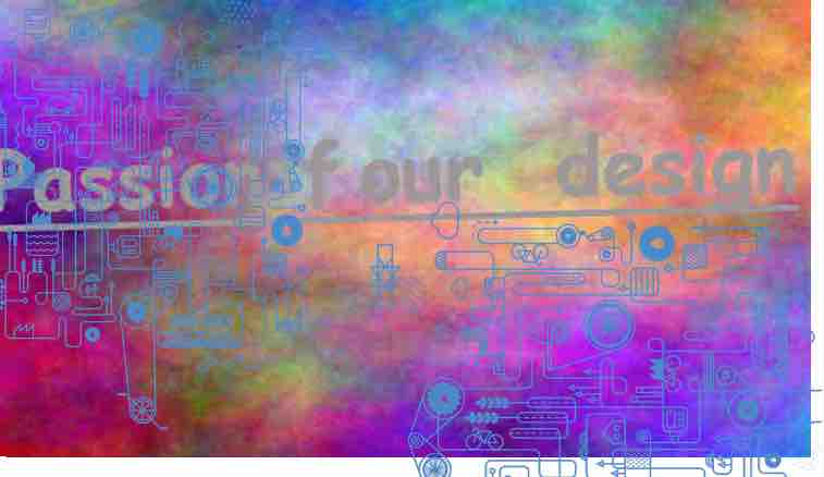
650Vue Part 4: A Passion for Design
The Bootstrap framework is handy for getting a project up and running quickly, but before too long, I find I want to see something other than Bootstrap's default styles and plain text over a standard white background. I was eager to come up with the right look early on in 650Vue's development process. If 650Vue is designed to simulate a late-1970s or early-1980s computer, then its design should evoke that era. Now, I am not a designer by trade but I do like to dabble in a bit of pastiche now and then, and, having lived through the target era, I have a good sense of the design elements that would fit my vision.
What I really wanted was an app that resembled some vintage machine like the KIM-1 or Commodore Pet. When a digital tool is made to resemble some real-world object, we call that "skeuomorphic" design. Commodore's Magic Desk was one of the first skeuomorphic desktop programs, with pictures of a typewriter, a filing cabinet, a digital clock, and a wastebasket representing program features for writing text, storing documents, checking the time, and deleting files.
Unfortunately, because digital tools are not physical objects, skeuomorphism often leads to some questionable design choices, forcing the user to interact with an awkward interface. Imagine an email program that forces you to manipulate a virtual stapler in order to "attach" a document, or a drawing program that makes you turn the handle on a virtual pencil sharpener. There's no functional reason for software to expect a user mimic these actions. Skeuomorphism must be handled with caution.
However, I knew I could rein in the worst excesses of skeuomorphism, and let 650Vue at least pretend to be a 1970s-era computer by looking the part, with big, chunky buttons, 7-segment LED displays, and an exciting array of blinkenlights. All text elements—including the manual—should be set in an appropriately retro-futuristic font, and the computer's virtual case should feature a badge label with a distinctive, period-appropriate logo.
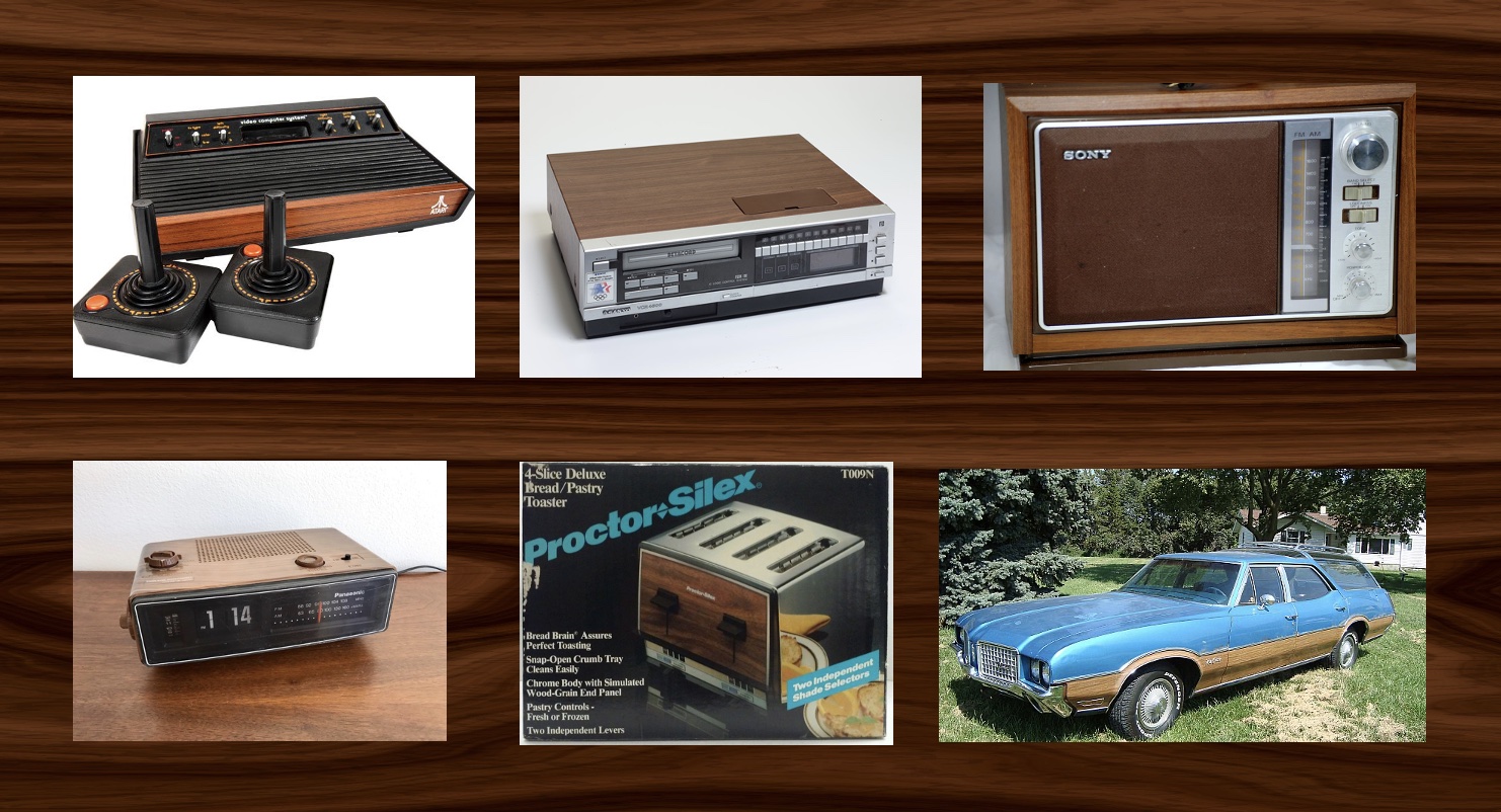
Artificial wood grain is a good way to evoke a vintage look; the 1970s loved fake wood on their electronic and mechanical devices, some of which are pictured in Figure 2. The classic Atari 2600 had wood grain along its front panel, and the VCR pictured above has pretend wood along the top. The radio and the alarm clock are encased in wood (or at least, something that looks like wood). The toaster—which, according to the marketing copy, features a "bread brain" to assure "perfect toasting"—sports a chrome body with a wood-grain end panel. The Vista Cruiser of the mid-1970s proudly displayed wood-grain side panels. Clearly 650Vue needed the warm, natural touch of artificial wood.
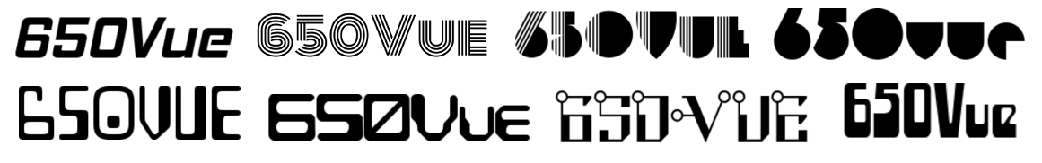
Fonts come and go, and typography is subject to the whims of fashion. There are two types of fonts: book faces, which are easy to read and therefore suitable for large blocks of text, and display faces, which are more ornamental in nature. I've collected some typical 1970s display faces in Figure 3. Geometric shapes and parallel lines are common design elements. Three of the fonts in my sample were inspired by the blocky "magnetic ink" characters readable by early computers. For the 650Vue logo, I chose a simple geometric display face with clean lines and rounded corners.
I chose Futura as the book face I would use for text elements on the 650Vue panel such as button labels and status indicators. I also typeset 650Vue's User Manual in Futura. Futura is a Bauhaus-inspired sans-serif font that features uniform strokes, wide, squarish capitals, and full circles for the uppercase G, O, and Q. As a kid, I owned several non-fiction books published in the '50s, '60s, and '70s that were set in Futura, a font that, to my mind, represents mid-20th-century optimism.
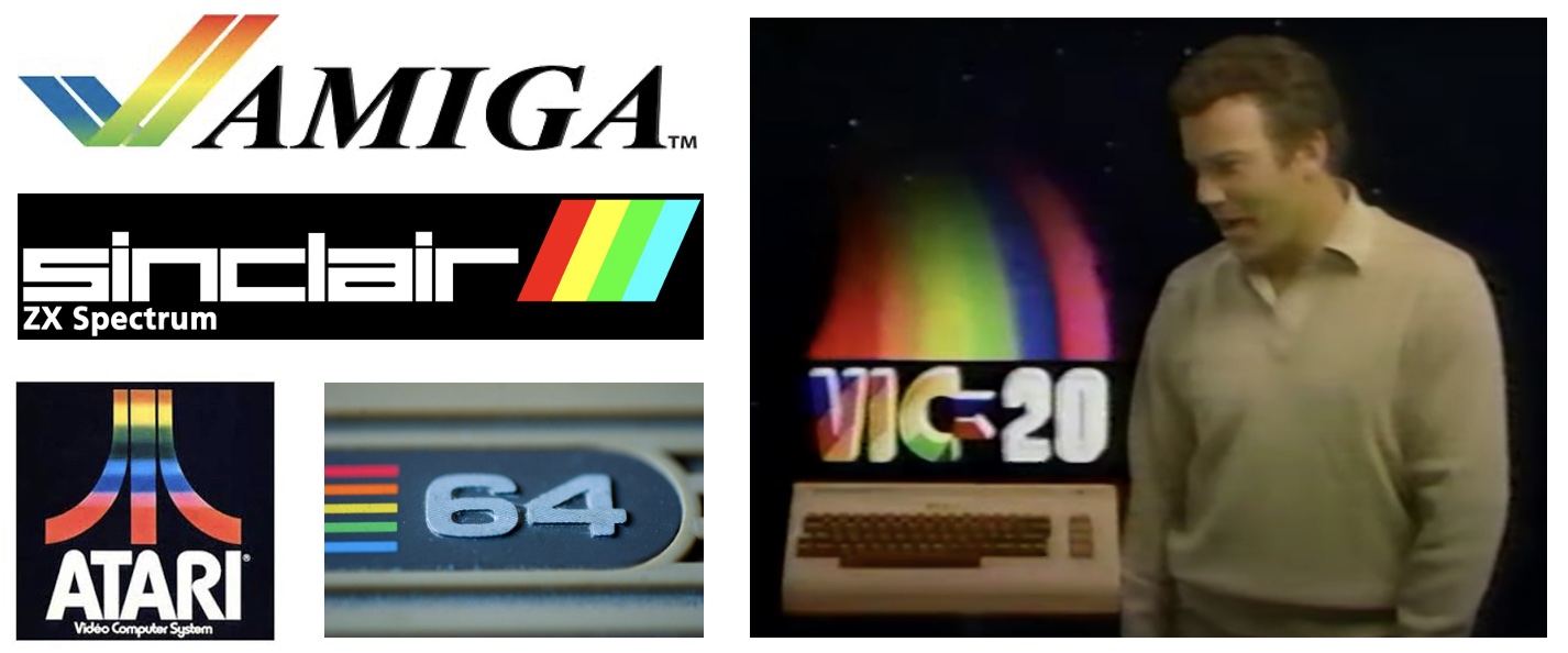
Advertisers of the 1980s really liked rainbows. It's easy to understand the symbolic value of a rainbow: before the '80s, most computers had monochrome displays, but the newer machines boasted colourful graphics—a major selling point. Colour was the future, and the marketing reflected that. Commodore's Amiga was identified by a rainbow checkmark, and Atari's "Mount Fuji" logo was often filled in with colourful gradients. The Commodore 64 and its UK rival, the Sinclair Spectrum, declare their colour capabilities with rainbows on their cases. The Commodore VIC-20—pictured in Figure 4 alongside Captain Kirk—decided symbolism was far too subtle and showed off literal rainbows in its television ads.
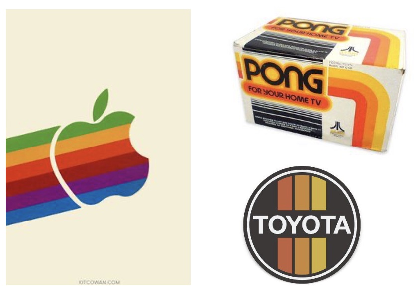
A decade earlier, in the 1970s, colour schemes were more muted. Apple's '70s-era rainbow logo, shown in Figure 5, employs colours that are dark, almost dull. The Toyota logo and the packaging for Atari's Pong console use colour bars that cluster around the yellow and orange part of the spectrum. These colour schemes probably had fancy names like "Autumn Harvest" or "Nevada Sunset" but whatever you call it, a dull orange is really just kinda brownish.
For 650Vue's case label, I tried to craft a rainbow that was a little bit dull and tending towards brown at the bottom. I went out of my way to pick colours that fought with each other; the bright red at the top clashes with the neighbouring purple, while the blue is too light while also being too grey at the same time. By making the worst rainbow I could, I think I captured the spirit of the 1970s.
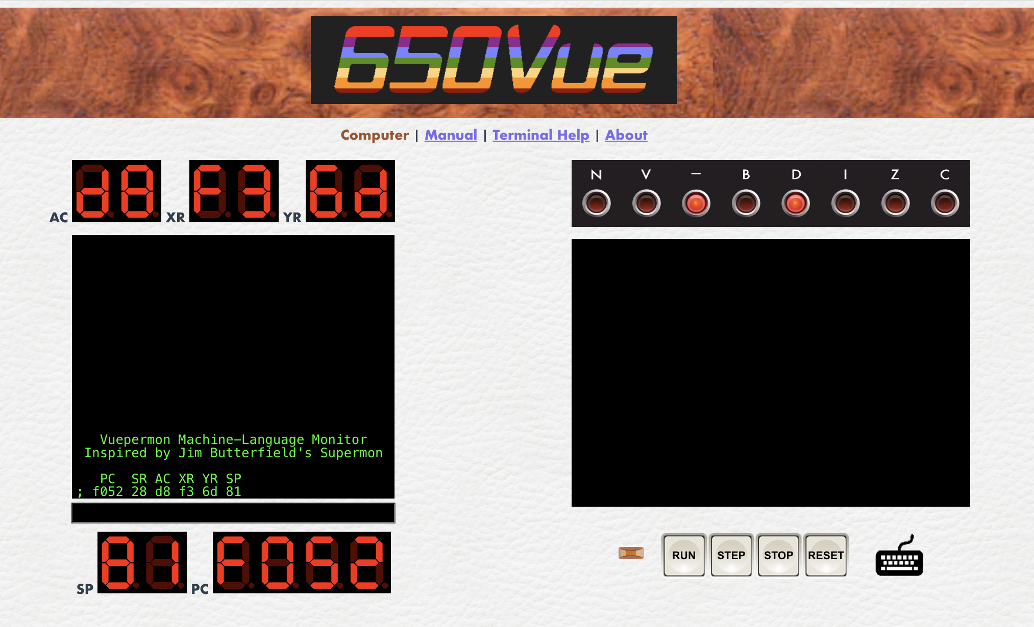
650Vue's final design (Figure 6) ties a number of 1970s-inspired elements together. The rainbow logo sits atop a burled wood top panel. The button labels and site navigation are set in Futura. The virtual computer features LED displays, a row of status lights, and monochrome text displays. The background is slightly textured to mimic the look of the white steel casing of vintage electronics.
My wife Cassondra deserves credit for the layout. We printed out screenshots of my 650Vue prototype, cut the paper into individual components, and shuffled the scraps around on a desk until we had a pleasingly balanced design.
In the next section, I will describe the technical details of the 6502 computer, beginning with a look at handling the 6502's internal registers.